 Dear reader,
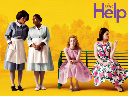
Among the recent films that I really liked, there was one that really made a huge impression on me. It’s a film along the same lines as “The Colour Purple” with Whoopi Goldberg, an extraordinary film that’s thought-provoking without being overly sentimental… one that you’ll never forget…
The Help is beyond any doubt a film you’ve got to see. It’s an amazing and moving film. The cast is outstanding; the actresses are remarkable and likeable. The main theme may be kind of serious, but it comes with a good amount of humour that gives it a positive feel and makes the film as light and refreshing as a mint sorbet on a hot summer day. It was like a cool breeze that almost literally dispelled the dark and gloomy clouds hanging over that Sunday afternoon… and it still cost me two packs of tissues…
What, crying? Me? No, just those stupid dust specks in my eyes every time… 😉 Let it be known, the Cosmetist does not cry… 🙂
You haven’t seen it? Well, what are you waiting for? Hurry up to the DVD rental place, or your Video On Demand system, or what have you. Just go see it 😉
I recommend it. Very strongly. It’s an immediate favourite. Here’s the trailer… if that’s not enough to convince you… 😉
This brilliant film reminded me of a problem I run into a lot with cosmetic formulation. Because besides feel and scent, there’s another important factor to keep in mind: the product’s colour. (Bet you saw that coming a mile away.) Of course, I’m not talking about the colour of the packaging, but the colour of a cream, or of a make-up remover, etc…
A client’s request about cosmetics colour
I won’t be discussing products that are supposed to be coloured blue, green or pink to indicate their active ingredients… in order to stick to certain conventions… Specifically, I’m talking about “white” colored products.
Indeed, when the moment arrives for me to present to my clients what I’ve formulated for them, you can count on it that they’re going to say something about the colour.
Clients: “We really like the feel of this moisturiser, but the colour… it seems to be off-white?”
Me: “Uh, yes, I suppose? Would you rather have something else?”
Clients: “Actually, yes… would it be possible to make it a brighter shade of white? A whiter white?”
Being a little bit colour-blind, I can have some trouble seeing subtle differences in shade… even with just white… That doesn’t help. 😉
Still, it’s really the typical kind of request that I get all the time and that can still present certain difficulties…
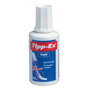
No beige allowed, and no light brown, and no off-white… We need white white, immaculate white… The kind of white that conveys an image of purity, the kind that seems to be synonymous to effectiveness in the consumers’ minds… The white of white laundry washed with the latest washing soap that washes them whiter than white, the white of Tippex correction fluid, that magical invention that was always my best friend in college, helping me correct my answers again and again, improving them a little bit more each time, just to satisfy my perfectionist needs… And then when my teachers told me my homework was a mess, I wanted to say: “no it’s not, it’s a work of art!”
But let’s return to the issue of colour.
The problem is that in a cosmetic formulator’s array, there are a lot of active ingredients and raw materials that aren’t white, and that therefore can’t be used if you need to stick to an “acceptable” level of whiteness. This way, in certain cases, things like the product’s colour come before the product’s effectiveness.
So when my clients absolutely insist on whiter than white whiteness, what are my main options?
- I could make a product with little to no active ..
- Or I could only use white or transparent ..
- Or I could still use coloured ingredients but use just a tiny little bit of ..
- Or I could use those same coloured ingredients (highly coloured vegetable oils) in the dosage recommended for the best .. and in that case, I’d need to compensate for them with white pigments like titanium dioxide.
What’s titanium dioxide?
It’s an opacifying mineral that filters UV, and it’s used in all sorts of products like sunblock, tooth paste, and even in medications. It has the particular property of also being a white pigment…
So if you’re wondering why your night cream contains this seemingly useless filtering mineral… it’s very likely that it’s in there to make the cream whiter or more opaque, to make it suit the “beauty standards” for cosmetics better.
What bothers me about it is that this pigment can be somewhat dehydrating, which counteracts the benefits we’re looking for, and there’s also the troubling issue of nanoparticles. That too is a matter of dosage, that’s true, but you know I’m a perfectionist…
In general, I’m not a big fan of this approach. You might as well put on your make-up in the evening before going to bed… Well, you could argue that the amounts of it that are used in these products aren’t really significant, but I’m rather uncompromising to my clients in private consulting. If you want beautiful skin, make-up or pigmented products (like night cream with pigments in it) in the evening are a big no-no. (Well, unless you aren’t actually going to bed, but that’s a different story. 😉 )
At night, your skin needs to regenerate, so you have to leave it be, let it breathe, and let it repair sun related damage, without burdening it and most importantly without getting in the way of its restoration.
So I’d recommend reserving this kind of product for daytime usage only, when the titanium dioxide can help protect your skin, as a filtering mineral. (Note however that it would still theoretically take much higher levels of titanium dioxide to achieve a high enough protection factor, but then we get the problem of the white stains that this kind of product can cause… about which I’ll be happy to tell you in a future article…)
What about you? Do you care much about the colour of a product? Is that an important aspect to you? Or would you sooner say: “Perfect white? Just another gimmicky marketing requirement that’s got nothing to do with reality…”
And about the film The Help: I know this is kind of a pointless detail, but Emma Stone’s hairdo bothered me a bit, I had the impression she was wearing a wig… Any Thoughts?
What interesting facts! I never knew that about the color while. I have to run see that movie now it looks amazing!
Thanks carolann for stopping by, yeah color is truly a parameter to control for marketing reasons. ( let me know what you think of the movie 🙂
I really like your blog by the way. Guys, go check her website, she did a great makeover with chalk paints that gave me some ideas for a few chairs I have…